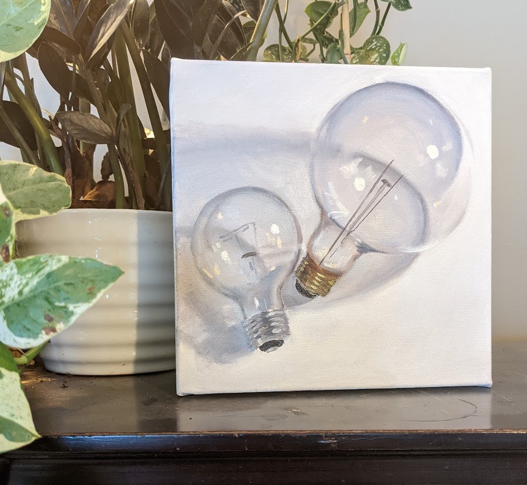
I am in love with white still lifes. In these still lifes, that at first look, are white, black and grey have immense subtleties of colour that are infinitely fun to work with. They hone an artist’s eye for colour sensitivities – particularly the sensitivity to colour temperature.
This particular painting also forces value choices as painters are limited to not having to include actual sources of light. The highlights on the bulbs are substantially brighter than the background just due to the fact that they are reflecting concentrated light to the viewer. This leaves the painter with a choice to darken the background to accentuate the highlights or keep the whole painting brighter and keep the highlights closer in value to the background.
The complexities of reflection in the bulbs are infinitely complex, which leaves us other creative choices and limitations. What my brain separates out as as detail is very different to what my eye is able to “see”. It is also time limited to the amount of time I choose to set for a painting and the general “looseness” I’d like to work within. With this I need to choose which reflections are essential information to read correctly and aesthetically jive with my creative output.
When you are working with coloured objects the viewer misses this. The viewer is blasted with a huge range of hue, value, temperature, tone etc. that they miss the beautiful subtleties. As a painter, it almost feels like choosing between a song by Lady Gaga or a song by Max Richter. I absolutely love both, but they fill very different needs and niches.
The calm of a white still life and the visual simplicity feels orderly and soothing. The loudness and strength of full value ranges in bright hues is lively, energizing and choatic. Of course you could challenge this by trying to create chaos and loudness in a high key white painting or to create orderly, soothing and calming aspects within a full value and hue range as well. Though, I believe by nature it is limited.
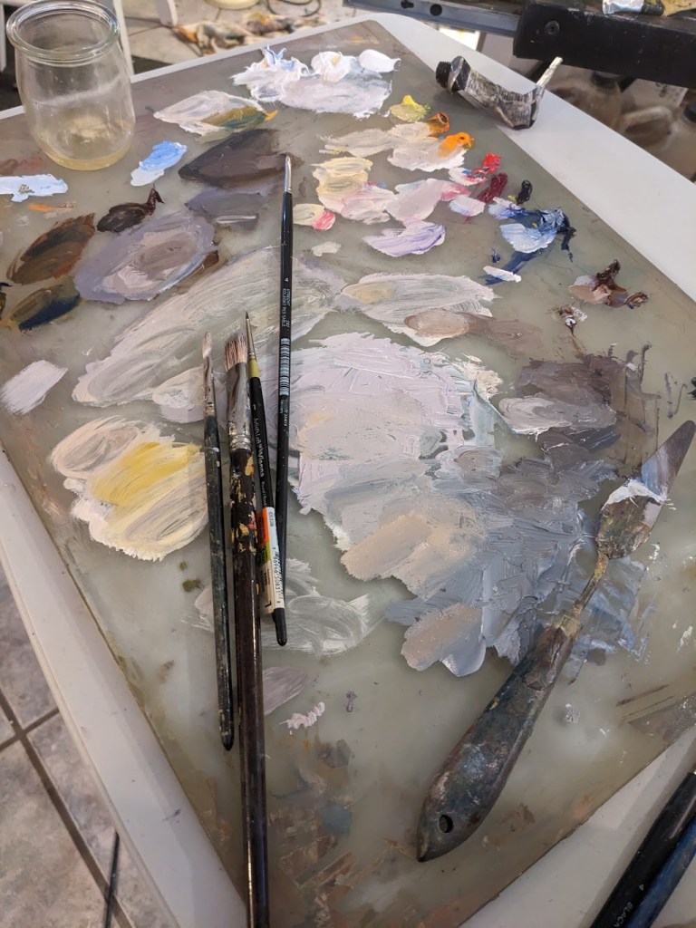
Palette for a White Still Life
On a side note. When I put in the ideal preparation time I am gessoing my canvases in a neutral grey now. I have found this particularly helpful in making my brights jump off the canvas. I spent much of my day yesterday preparing small canvases and panels so I can work on grey panels! I feel rich in preparation now and can’t wait to dig in to paint on them!
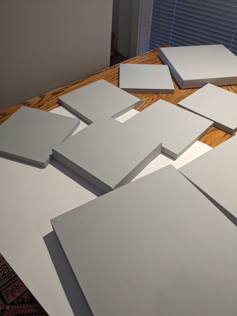
Future White Still Lifes
There is still space in the Still Life class starting January 12 2023. Email me at jessica.j.hedrick@gmail.com to sign up.
